Glad to have new readers! This is an open forum for discussing the artwork I have submitted in the Art section of the Articles, or as illustrations for some of my articles in general. My professional Facebook page of my artwork can be found here , [Edit: Link removed, because Facebook is toxic] if you'd like to see more of my sketch work, academic work, and in-progress sketches. And if you'd like to peruse my real-life portraits, and professional published gaming illustrations, you can take a look at my gallery on dA.
My first submission is interestingly the first piece of art seen by participants of GreyTalk just about two years ago.
When I figure out how to embed the thumbnail of the drawing "Races of Oerth (the Usual Suspects)" I will edit, and include it here, just for the sake of reference. ... and also a link to the article submission once it's created.
Well, I wanted to give a little show and tell of what i am doing these days for art ...
This is an illustration that is completely digital. I am working on a Wacom Intuos4, with an Nvidia GeForce 9600 video card, using Vista Ultimate.
The illustration itself is of a very small colliseum that is described in an article that I am rushing to complete for the PostFest XII(Richfest 2009): Ancient Greyhawk Sites which ends in six days. There's actually two illustrations that go with it, but I am trying to bang out the article itself.
The article is on the place that I have illustrated here ... it was built for a Captain that was instrumental in the Nameless Legion (from Dragon Magazine #204, if you happen to get a look at it), but retired after a good long while. Anyway ... this colliseum had a single portal built into it, that was made so that he could return to his homeland and and still get to the war as he needed. the interesting part? The Captain was a wemic, and his homeland was in the southern Kabreevo plains of Hepmonaland!!
Here's another recent piece that I have been working on ...
This one is digital as well ... it's drawn on a Wacom Intuos4, with an Nvidia GeForce 9600 video card, using Vista Ultimate.
It's actually a real pleasure to be able to do this one. I did the original sketch several years ago (in graphite pencil on plain white paper), and I have always planned to do so much more with it. Just yesterday, I was speaking with Rick "Duicarthan" Miller (the editor of the Oerth Journal) and he mentioned to me that he intended to use the art in OJ#25 which is finally coming out soon after much anticipation. I'd told him that he could use it well over a year ago, and I had nearly forgotten that he had it!
So, after talking for a bit, we decided that since the OJ#25 isn't going to be out for just a few weeks, I had time to fill out the artwork just a little. he had already formatted the magazine, but he was willing to replace the piece for Mordenkainen. ... he says I was crying and being a baby , but, I was really just trying to ... offer my best work.
So, I would like a little feedback: I've drawn Mordenkainen with the square beard that has silver in it, as Clyde Caldwell depicted him on the cover of "Mordenkainen's Fantastic Adventure" from 1984. I wonder if you guys think that it looks better with the little VanDyke pointy beard that he's been shown with in more recent years. and i am wondering if the moustache needs to be thickened up a little bit too, maybe?
Well ... here's the last bit of preview before the wemic article comes out. This one goes with the colliseum from above. It goes with the PostFest article ... and I am really happy with the "ancient GH site", and the mythology and legend that goes behind it.
Still adding a few final touches ... but, it will be on the main page soon enough.
The fun part to me, is that the pose in the illustration isn't very precise about who's going to win ... actually ... who do y'all think is going to win, and why?
Well, the human is dead, because the lion claws of the Wemic are about to rip his chest open, ribs and all, if the Wemic possess the power of a lion.
As for the human killing the Wemic, that depends on whether or not the Wemic's heart is located under that knife, in the lion portion of the body. If the Wemic's heart is loacted within the human portion, then the Wemic will survive.
Definitely some good work, Ic. And concerning the Mordenkainen pic, since Mordenkainen's Fantastic Adventure depicts him with a full, thick beard and mustache and a full head of hair, I'd suspect his clean-shaven face would have a fuller mustache. I also like the square beard, since the pointy Anton Levay look just bugs me. Levay was such a....but I digress. It also wouldn't bother me to see Mordy with a little 5 o'clock shadow on his round little head, since I just don't picture him as being all that fastidious about his appearance.
Looks good Icarus, although I gotta ask, what's Mordy doing to that poor hound dog?
LOL!! I wish that I had seen this earlier!!
He's not doing anything to that poor dog, except summoning him!! It's "Mordenkainen's Faithful Hound" ... he's coming out to protect us all from the evils that lurk in the night, and from having to pull watches at night.
I thought about including more of them since he had many more in the spell section of "Greyhawk Adventures", but I figured that the PHB ones would be the most likely to be recognized!
thanks for all the input on the drawing guys ... I wish I had more time to incorporate all of the little details. But, as I continue to work on the piece, even though it's already published, I garauntee stuff will be added ... especially a bit of stubble.
Alrighty, guys ... time for another installment of "How does This Look?"
This is for the current PostFest on villains ... the guy is a drow cambion (also known as half-fiend), and I am trying to get some elements together for it to see how I should make him look ...
I want you guys to tell me about it ... remember that it is going to be in Black &White, so "demonic red eyes" are sort of out, but the horns and face and all should really try to convey the character. Remember he's not wholly demonic, and that he should still be recognizably Drow. The horns will likely be black, or nearly so, kind of like his skin tone.
Whaddaa think - thicker, thinner? Different surface texture? Straight forward? Back? Curved, rigid, smooth, blocky, swept? How about the hair? Should that be non-Drow looking? I tend to think that if he didn't have the hair, he wouldn't look so Drow-ish.
I think that when I drew the Drow part of the face, it is done as a model, and so, it looks too placid. ... too plain faced. I think that in the final version he will need to look meaner - like he's got an upset stomach and he is going to take it out on someone!
Anyway ... let me know, and I look forward to hearing input on this one.
Also, the final draft will be in a different pose, I think, but this is just the study.
Well, it's here! That newest Oerth Journal has arrived on the 'net! Oerth Journal #25
With great thanks to Rick"Duicarthan" Miller, I am now - officially - a Published Artist, and can rack up my very first credit to put on a resume. Even though I knew it was coming, seeing my lilustration of Mordenkainen made me thrilled and happy and overjoyed at the same time. Looking at it now, I wish that it hadn't needed to be turned in, because there's so much more work that should be in it. I've actually done more stuff in the recent months since it was submitted, and I have piddled around with it a couple of times, adding to the illustration and filling it in some more. I wanted to really do it up large ... maybe I'll see if I can find time to JPG it and post it here for the sake of posterity so that the more recent version of it can be seen, even if it can't be published in the PDF with the article.
I'm still thrilled to see it in the Oerth Journal, becasue that's been one of the greatest things I've ever gotten to read as a fan and it means alot to my heart to be published there. Thanks Duicarthan. :)
The 'races' pic is classic, despite the lack of gnomes. Maybe you should do a second panel, if you have time? It might include gnomes, goblins, ogres, the strange dark-skinned humans from the Sea of Dust, etc.
Actually, it's interesting that you mention it ...
GLH (Pluffet Smedger the Elder) and I have talked many times over the past year and more about a project on the Races of Oerth. He would like to use the artwork and a couple of other panels in the same style as link-maps to information about each of the races and subraces shown. What's more, we've even talked of this including some of the iconic "monster races" of the Flanaess.
This is actually one of my favorite pieces, because it was this that got me first noticed as an artist among the GH/Canonfire community, which also led me to being published in the recent OJ#25, so there's ... nostalgia, I suppose. I guess that makes it a "classic" (as you put it) in my (somewhat teary) eyes. Thank you, CM for the thoughts about it.
Well, I was digging through my old gaming stuff while moving into a new apartment these past few days, and I found something that I had meant to do something with a couple of years ago, and never did.
This is a small sketch that was originally done on notebook paper while trying to work out a few things about the size and proportion of Oerth. It's entire dimensions are only a few inches across. I was making estimates, and whatnot, trying to figure out what time it would be and where the sun would go if mages were teleporting all over the globe, and it led to a map project. So far, it's led me to wanting to make a larger (3ft x 4ft) antique-looking map that one might see in our own IRL Age of Exploration, complete with "Here There be Dragons", and ships and sea monsters drawn in the oceans and course markings for ship travels. One day I may finish the larger project that has been in progress ever since, but ... it's a nice little bit of fluff that I thought someone may enjoy seeing.
For those that are interested, the map is set up as a modified Goodes Interrupted Homolosine Projection. This is my own concept of how the flat maps are supposed to reflect the actual globe ... I know there are varying opinions about the accuracy of measurements of this map or that, but take into consideration that this is mostly intended more as artwork than a scale of this nation or that continent. It's just how I perceive Oerth.
Apparently, canon disagrees.
Taken from TSR 9577 Greyhawk: The Adventure Begins
Quote:
It was established long ago, as everyone knows, that Oerth is a great rotating sphere floating in a void, around which its sun and moons revolve. Careful mathematical measurements and magical divinations reveal that the circumference of Oerth is 25,200 miles. Thus, the diameter of Oerth is about 8,021.5 miles, and the total surface area is about 202,139,540 square miles. Of this grand figure, we have sure knowledge of only a tiny fraction, and sketchy fragments of only a little more. Our mathematical reach exceeds our physical grasp.
*runs off to hide* _________________ The Golem<br />
Come, come ... every farmer and peasant knows there's only as much as one can see in front of their face. They've heard all that silly speculation from sages and rumours from ridiculous people who claim to travel, but, everyone knows that some of those weird monsters and things don't exist. Least of all those floating rocks way up in the air that people say have air and other people living on them. And what do you mean about these people across the great oceans? Everyone knows there's nothing but water and sea monsters out there, and those ridiculous tales of explorers are nothing but tavern tales and fanciful legends to make young men want to leave their responsibilities behind.
I just want to take a quick minute to say thanks and give a little appreciation for the views and comments that you guys have offered. You have really helped me feel validated in the artwork I do.
That being said, I really did expect a comment or two about the content of the map itself. Since I am turning this into a large project, though it may not be done soon, I would like to hear what you guys think about the depiction itself and the placement of places like fireland and stuff. So, while this is just an artistic representation, I would eventually like to put it out there for all of the fans to have and would like a little constructive criticism about the content - especially about how places should be labeled and the decorations that should go on it like sea monsters or cherubim blowin the zephyr winds in the four corners or what have you. Or if I should label things like Keiland when it was an Emipre, or the Great Kingdom, or labelling things from the Dragon Annual map, or using the OJ Beyond the Flanaess project.
At any rate, I hope to have a bit of feed back, an I look forward to what you guys have to input. _________________ Owner and Lead Admin: https://greyhawkonline.com<div>Editor-in-Chief of the Oerth Journal: https://greyhawkonline.com/oerthjournal</div><div>Visit my professional art gallery: https://wkristophnolen.daportfolio.com</div>
I turned into a hermit! I just wanted to pick back up where this whole thing left off ... with artwork again. These two are likely the best of what the past nine months has given.
This first is called "The Brothers Three". It is a depiction of the three sons of stern Alia. The three gods of war that appear in the WoG. ... Heironeus, Stratis and Hextor. It's not quite finished yet, with Hextor needed a little more work and a bit of revamping - I was mistaking his face with Erythnul's because I didn't remember what his face looked like! Oops! At any rate, i am thinking about a second version afterwards, of the three, but using Hextor's human aspect - which more resembles his two brothers - rather than the monstrous form.
Unlike some of my other, more recent drawings, this is done in graphite on stock paper.
Sheesh! Can you imagine getting these guys all in the same room for a photo op?
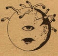
Next, below is one of my favs ... it is an example of the best work I have done, period. It is also done in graphite on stock paper. It was originally a little sketch I did and was a study of hands, really ... then months later, I wanted to do a full version ... it kind of draws on both Greco-Roman mythology, and also on Shiva for the multi-armed aspect of it. I wanted each hand and arm to be different, but some of them ended up being my own hand/arm used as a model. The uppermost arm stayed uncompleted for months before I really got the idea of what I wanted to do with it.
So, tell me what you think, and let me in on the fact that I got the gods all wrong, and Medusa's all messed up. ... I'd love to hear what you guys think would be good to do with these.
Hey there, guys! Thannks for the responses! Glad to have feedback on using my art for gaming ... it's been a while since I've had any.
Smillian ... you're right. Hands are terribly difficult. Interestingly, I often use myself for a photo reference (holy crud, did I really model for a *medusa*?). In fact, the previous illustration with the wemic, I did that by using not only myself, but, Anna with me to ge tthe poses right. Anyway, that upper hand - and all of them in general - made me look like a retard while I drew. I would draw for a few seconds, then turn my hand to face me in this weird, rigid, nearly spastic-looking clench, then release it and draw for a few more seconds, and then psuedo-spasm again. <chuckles> Good times.
Argon ... yep, the Shiva connection is totally there ... although, I think that Shiva is often depicted as being male. Shiva only is usually shown with four arms, and I have been asked if this was intended to be a half-fiendish marilith-medusa. Which, <meh>, you know ... maybe somewhere in my subconscious, it is. Who knows. I think that I really sort of have a thing with monsters and such with multiple limbs, as this recent stuff shows. I'll try to get another of my pieces up soon, which is an enormous demon with multiple arms, called "The Beast Within". Coming soon, to a web browser near you!
Also ... all of the quotes and stuff ... muah-ha-hah! You've given me material! I embarked on writing a new campaign for my home game. It's Greyhawk, but it takes the form of a Yuan-ti invasion, based on the "Incursion" campaign (Dragon Magazine, June 2003). And the big, bad, evil guy (gal?) is the Brood Mother of the Yuan-ti! And guess what all your snake-y comments inspired? "Issa'met" ... great name for her! I think I will abscond with that one, if you don't mind! She might be in there with the medusa soon enough!
Excuse me ... I meant to say "The Medusa". <lighthearted conspiratorial wink> _________________ Owner and Lead Admin: https://greyhawkonline.com<div>Editor-in-Chief of the Oerth Journal: https://greyhawkonline.com/oerthjournal</div><div>Visit my professional art gallery: https://wkristophnolen.daportfolio.com</div>
Last edited by Icarus on Mon Feb 28, 2011 1:11 am; edited 1 time in total
And so, here I am again ... I promised to show you guys The Beast Within, and so I am putting it up, with a companion piece. Obviously, it's an heavenly angel/hellish demon type thing ... they were drawn almost back-to-back. Both were done in graphite on stock paper, using only an HB 0.5 lead. ... Caelestis Sophia was completed in about 14 1/2 hours, while The Beast Within was 28 1/2. Both were done in the last week of July '10.
There's really not so much about this one... I had drawn the Caelestis Sophia (below) and a fella I knew told me that I should do "some evil ****" ... so I did. A notable point: I don't ever recal having done intentional gore before. He was offering continual advice but, as I let my inner stuff pour onto the sheet, is became more and more my own. Parts were left undone as I struggled to find a way to complete it. The face was te final part ... I had struggled with it in sketches and couldn't really find the way I wanted it to look. So, I marched over to a mirror with sketch pad and pencil in hand, an I looked straight into the mirror and screamed at it. ... That became the face of the Beast.
The next is Caelestis Sophia - and if any of you are up on Latin (especially ecclesiastical Latin) then you know that the title means, essentially "Heavenly Wisdom". In mos ancient texts, Wisdom is personified as a woman, and I was in the mood for drawing an angel ... when I couldn't figure out what to do with her outstretched hand, I thought, "I know! A book!" Thus, I began to think of her as the personified angel of Wisdom. ... and that, as they say, is that.
So ... I don't know how useful these would be in a game ... I am thinking of shifing the contrast in The Beast within, because the scan looks a little washed out compared to the original. What do you think that these could be used for? Can you think of how they might be used as allies or foes? And which is which? Could the angel be the foe, and the demon the friend? (maybe not with that corpse in his hand! ) At any rate ... I hope y'all like 'em.
Oh, and Argon ... I've been braggin' on that particularly poetic turn of phrase ... I am telling all my friends IRL that might have been the coolest thing anyone's ever found to say about my art.
Argon wrote:
Your artwork feels like a title for a well written story.
I don't tend to use much in the way of extra planar stuff IMC anymore but I'm pretty sure I can keep these up my sleeve in case I do again; the weird thing is, when I saw the first picture I thought "Oh! Chaos Infused Gargoyle Lord". And I thought I was drinking ordinary tea
... the weird thing is, when I saw the first picture I thought "Oh! Chaos Infused Gargoyle Lord". And I thought I was drinking ordinary tea
Wow ... that's friggin' hilarious, man! OMG. But, I think that the really great part is that you've got stuff like that in your head. i put games terms to things that I see all the time, and sort of do a "Linean Classification" of all the things that it could be ... but I have to admit tht I never exactly thought of that one.!!
There's a great question, actually!! What on earth is it? A Gargoyle Lord? Baa'tezu? Tanar'ri? A Fiendish Tainted Raging Gom'gol Slavemaster? There could be all kinds of templates and monsters this could be!! Come up with some, and see what we can come up with! Fun!
Glad that you guys are still keeping up with the thread. I was thinking of putting a GH Discussion topic to remind people that it's still there ... especially for the people that haven't ever seen it - new users and such. There's a lot of people, I think, that only ever look at the headlines on the main page and don't do too much searching of the forums.
Thanks for the comments. Truth be told Icarus artwork coupled with me playing a bard for the Spine Castle campaign has really inspired me. Although I must find a way to incorporate my Chanter of Spirits mantra a little more.
You'll find a little bit of poetry in my last postfest submission.
Of supple wood, of rosy glow,
Mistress of wind, my heart endures.
Your lips to mine, and mine to yours,
The toils of man, are made undone.
When your voice is heard, divine I become
Now you are gone, forever lost.
My heart is nothing, in angst, in pain,
Without you I wither, each day."
I also posted it here you can follow the exploits of Aoric the bard who speaks for the dead in the Spine Castle forum.
It's been a few weeks since I have posted anything new, but, I am working on an Illustration of a famous Bandit Kingdoms red dragon by the name of Morganstaler. There's been a couple of sketches for placement and layout, and the first version ought to be ready on Thursday.
But, in the meantime, I wanted to put something up on the thread. So ... this is actually an older drawing, but I am pulling it out of the archives, so to speak for the Postfest XV article I am writing today ... The Swamp Hovel of Maderick Darkstone.
It is originally 5 1/2" x 8", done on stock white paper, in graphite, with a 0.5 lead (HB, and 2H). The trees are modeled on mangroves, if memory serves. It's intended to be something like a mud-dauber's nest, and a dwarf-made "cave".
The NPC was actually once a PC, and he became important to the campaign story to the point that nearly 10 years later, I am still using him. He's a worshipper of Muammon Duathal (or Marthammor Duin, if you prefer a different pantheon). So, he's a scout-guide sort of fellow, but has a lot of other things to offer those who find themselves in the swamp. Trader, merchant, pawn-broker, quest-giver ... just about anytime I need someone to be helpful to the PCs. He's a bit surly, and is very isolated, so isn't exactly your average dwur.
My question: What do you guys think that I could do with the hovel? Interesting things to place there, things to do there, or unusual ways to put Maderick in a campaign? "Lairs and Sidetreks" is the name of the game! Come up with some interesting ideas, and I will put them in the article!
I really like the background to this piece of art. The trees alone are inspiring.
However if you like the entrance to the hut looks like it is very well built stone. Perhaps the swamp hovel it self looks like nothing more than a small hovel. However in reality the hovels owner can hide other rooms or chambers in pocket dimensions stone keys which can be pushed into certain hovel walls can lead to others planes or places plane of earth, fire, water, air or maybe to other hovels all over Oerth its not like swamps do alot of business.
I really like the background to this piece of art. The trees alone are inspiring.
... the hovels owner can hide other rooms or chambers in pocket dimensions ... other planes or places plane of earth, fire, water, air or maybe to other hovels all over Oerth ...
I know it's probably obvious, but the trees and the scene are inspired by Yoda's hut on Dagobah from Star Wars. I really love swamps for some reason. I have run entire campaigns in the Hool marshes.
The pocket-planes remind me of the Citadel of the Planes from the Stronghold Builder's Guidebook.
Stonghold Builder's Guidebook wrote:
No part of the citadel of the planes sits on the Material Plane, but an unassuming door ... is
actually a portal that leads to the central trophy hall on the Plane of Shadow. From there, portals lead to other rooms on other planes.
Amazing art Icarus. MY daughter is a budding artist and I showed her your work and she was totally blown away! _________________ Dymond
-My kingdom for a Shield Lands map!
Dymond ...
That's really cool that your daughter is a budding artist. And it's even cooler that you encourage her art like that. I'm not certain how old she is, but let her know that art is something that she should never, ever let go of. When I was a teenager, I didn't draw the way I do now, but, it was a matter of practice. I never found anything that I loved doing more than just sketching and doodling, and eventuallly, it came to the point that I learned more about what I was doing. I was self-taught for most of my drawing "career", and that's why I took so long getting to where I've gotten - I've been drawing for over 25 years now.
But, now I am getting ready to attend the Academy of Art University in San Francisco to eventually earn my Master's in Illustration, and I've never learned more from art than when studying in a formal setting. They have online courses, ranging from beginners to advanced courses.
At any rate, I was talking with the guys in the weekly Thursday night Canonfire group last night, and it looks like I will be posting a new sketch for the cover of the Bandit Kingdom's "Rogue's Gallery" ebook. So ... look for that. Since, you know, I've been fudging about letting anyone look at it yet. Oh, and be sure she learns about deadlines. _________________ Owner and Lead Admin: https://greyhawkonline.com<div>Editor-in-Chief of the Oerth Journal: https://greyhawkonline.com/oerthjournal</div><div>Visit my professional art gallery: https://wkristophnolen.daportfolio.com</div>
Alright ... so, I decide to go with something a little different than what I had been planning. I am going with a single portrait of Cranzer, and possibly putting Morganstaler (big ol' red dragon) in the background. ... also, I'm thinking of putting a close-up portrait in the corner.
This is entirely digital, drawn using Corel Painter 11, a wacom Intuos3 digital drawing tablet, on an Nvidia 9600.
This is a 3rd Edition stat block for Cranzer, with a little description at the end. BDK6i-01 The Great Hunt, 596 CY, BDK6i-05 A Heroic Return, BDK8i-04 All Evil Things...
LESSER BONEHEART CRANZER CR 18
NE male human
HD 18; Wizard 7/Loremaster 8/Archmage 3 (Iuz)
Languages: Common, Abyssal, Draconic, Elven, Drow Sign Language; tongues
Abilities: Str 8, Dex 14, Con 12, Int 19, Wis 14, Cha 12
Signature Gear: bonewand, brazier of commanding fire elementals, dagger +3, ghastrobe, mirror of mental prowess, rings of free action, invisibility, and protection +5, wand of fire
Unusual SQ: High Arcana (Mastery of Counterspelling, Mastery of Shaping, spell-like ability [2/daychain dispel])
Signature Feats: Brew Potion, Craft Construct, Improved Counterspelling, Reactive Counterspell, Portal Master
Signature Skills: Concentration, Craft (alchemy), Decipher Script, Heal, Knowledge (arcana, religion, the planes), Spellcraft, Use Magic Device
Description: At 5'4" tall and bald, Cranzer is far from an imposing figure. Affecting dark blue robes with blood-red and gold-trimmed edging, he looks more like a tailor than the master alchemist and wizard that he is.
This is very interesting. The bit above about Cranzer being more like a tailor than an alchemist or member of the Lesser Boneheart reminds me of that comment about the Nazis and "the banality of evil".
Far too many illustrations of evil characters go for the signature "look at me I'm obviously a villain" accoutrements of skulls, blood etc.
There's something far more disturbing about a character that doesn't look obviously evil but is; but you need to know that as an observer prior to seeing the illustration or it might not work. As we all know Cranzer, I say go for the bland, but maybe add a subtle twist that you can see if you look hard enough and that gives his true sentiments away (assuming of course that the man with the paycheck agrees). Perhaps the background may reveal the tools of his trade while the man himself in the foreground seems a reasonable type; a "come into my parlour" kind of guy.
My personal view is that the dragon might be a distraction from the main character, but that's just me, I love the less obvious.
So ... doing a little project for the Oerth Journal ...
Today I had a very strong impetus for drawing hit me, and I started to put more work into the Oerth Journal's "Beyond the Flanaess" Whole Oerth Project. The following are thumbnails of three different critters that are to appear in the Oerth Journal #26, which I am told is near completion.
These were sketched in 2B graphite on white stock paper, then scanned and are being finished digitally on my Wacom Intuous3 with Corel Painter 11.
A Terracotta Golem, Mountain Strangler, and Verdant Gloom.
I know the last one is kind of unclear, it's a plant creature like an assassin vine with a green (though B&W) cloudy haze around it. ... and I have no idea why the Terracotta Golem has a square hat, but it's what the author included. _________________ Owner and Lead Admin: https://greyhawkonline.com<div>Editor-in-Chief of the Oerth Journal: https://greyhawkonline.com/oerthjournal</div><div>Visit my professional art gallery: https://wkristophnolen.daportfolio.com</div>
Last edited by Icarus on Thu Apr 11, 2019 12:14 am; edited 2 times in total
Well ... here's the latest version of the Terracotta Golem ...
This stage of details are all digital now. There really won't be an "original hardcopy" of this drawing once it's done.
I was given suggestions by the publisher that the kilt (decided by the author) should be something different; maybe Egyptian themed, or Aztec/Mayan. I went with something a little more Polynesian. ... ish. It's intended to be sort of geometric like the Hawaiian stuff you may have seen, and yet, not really particularly anything specific. The square hat definately throws things in a different way.
Since it sounds like this is still in its draft stage, I'll point out that a second set of arms would, realisticly, at least, require a second set of chest muscles. Yeah, I know it would require a whole lot more, but that is just what jumps out at me, so adding that in might allow for better suspension of belief.
Otherwise, I like the looks. That Verdant Gloom is especially intriguing.
Wow ... has it really been seven months since I've posted my artwork here?
So ... the thing is that I am working a lot on pursuing a Master's of Illustration, and I haven't really found much time to do artwork of my own. But, just today, I found time to work on a project that I've really been wanting to do for about six months now.
It's basically a Hindu Goddess, but, I am wanting to do something that is India-influenced without sticking to all of the very old forms and rubrics of the way art is traditionally presented. Indian religious artwork tend to have a very "medieval" sort of feel to it. ... nevertheless, I want to do this goddess called Parvati ... she's a protector, and defends against the evils of the world, but in a mothering kind of way. Okay, a Mama-bear kind of way.
At any rate ... this is from my sketchbook, so it's 8 1/2 x 11. It's in graphite, and took about 4 or 5 hours. She'll actually be riding a tiger, and wearing a bare-midriff sari, and holding weapons and stuff. but, this was mostly a study for the poses of the arms and whatnot.
Let me know what you think ... I've not really shown it to more than one person, and I would love to get a little feedback. Feel free to ask questions about the final that is planned if it would make it more clear what this is for, or whatever. _________________ Owner and Lead Admin: https://greyhawkonline.com<div>Editor-in-Chief of the Oerth Journal: https://greyhawkonline.com/oerthjournal</div><div>Visit my professional art gallery: https://wkristophnolen.daportfolio.com</div>
Last edited by Icarus on Thu Apr 11, 2019 12:16 am; edited 2 times in total
I would think some type of duality to show her two sides. Perhaps holding wheat above her head, a pitcher of water and a spark of fire. Weapons a Sickle, wood cutters axe, and a harpoon or trident.
I'm looking forward to seeing a more complete version. Perhaps a hyme or poem might accompany it. I will have to see about Parvati.
NICE work Icarus!
Very talented indeed..
Back tracked thru this entire thread and found your link to your site ( which I recommend to others to peruse)
Great works there too.. Really like your Rhenee Bargeman ( see a bit of Johnny Depp there??)
and the Calis picture IMO bears some resemblance to Adrian Paul (of highlander) Not to go unnoticed, your depiction of all the Flanness Peoples were equally cool
Quote:
Icarus wrote:
There's a lot of people, I think, that only ever look at the headlines on the main page and don't do too much searching of the forums.
Yep! "Laziness" is alive and well!
We're "still here," my friend. Keep it coming!
Just to let you know.. your work has not gone unnoticed... I endeavor to be the Lord of resurecting hidden threads of treasure.. hehe
Back tracked thru this entire thread and found your link to your site ( which I recommend to others to peruse)
Great works there too.. Really like your Rhenee Bargeman ( see a bit of Johnny Depp there??)
and the Calis picture IMO bears some resemblance to Adrian Paul (of highlander) Not to go unnoticed, your depiction of all the Flanness Peoples were equally cool. Just to let you know.. your work has not gone unnoticed...
Thanks for the compliments, Dark Lord Galen! Prompted by your mention of my personal Dropbox gallery, I added a link in my signature to the site.
The Rhenee bargeman is definitely drawn from Johnny Depp; he's one of my favorite models. I have used him for three or four different characters, and countless sketches over the years. ... and that character was used for an article called "The Laughing Turtle" for a postfest submission here on Canonfire!.
Caltis, believe it or not, was drawn from a fella that I met while I was in college. His face matched the sketches that I'd done for the character almost precisely, and I told him I'd give him all of the cigarettes, coffee, magazines and food he could want, if he'd just sit long enough for me to draw him!
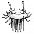
The "Usual Suspects" was one of the first drawings that the Canonfire! crew ever saw of mine, and I have wanted to get around to doing more of those for years. It was originally intended as a player-aide depicting some of the main racial types they could play, and to recognize racial stereotypes when they saw them.
Thanks again for looking through the thread to find all the stuff! _________________ Owner and Lead Admin: https://greyhawkonline.com<div>Editor-in-Chief of the Oerth Journal: https://greyhawkonline.com/oerthjournal</div><div>Visit my professional art gallery: https://wkristophnolen.daportfolio.com</div>
And so ... here it is once again, time to add a little artwork to the thread.
the university semester is over, and I am looking for ways to kill a little time before the travelling starts for the summer (for weddings and high school reunions, and conventions).
So, here's my two latest offerings: they're done for the Paizo magazine Wayfinder. It's a recurring column called "Weal and Woe", in which they present two NPCs; one a potential ally, the other a potential threat. These two are swordsmanship instructors from rival schools.
They're drawn at 9"x12", on 50lb paper, with graphite and a touch of conté. In retrospect, I wish that I'd done the first illustration a little bit darker, because when the second one came out, they look very different by contrast. Unfortunately, the first had been submitted by the time the second was finished. <shrug> Ah, well. C'est la vie.
Hope you guys like them ... if you play Pathfinder, or are interested in the article, the magazine is distributed free (I think) from Paizo, as a PDF. It should be available the first week of July.
Nice to see you up and drawing again. In the lighter shade picture I prefer the full model it looks very complete and well put together. Though the portrait could of benefited from the darker lines in the second drawing.
Hence, I prefer the facial expression in the darker shade but the over model looses a little something in that shade.
Just my opinion. Both shades work well but for different things. Keep it coming.
Hey there, Argon! Thanks for the comments on the art. It's not really that I haven't been illustrating, it's just that I had a lot of work to do this semester. I'm studying toward a Master's in Illustration, so, the time and imspiration that I did have for art was largely used up on my university work. But, yeah, it's nice to be drawing fantasy illustrations again. I'm hoping that I may find time to do a small project for Sir Xaris (Skip Twitchell?) for an article that he's written for the Canonfire Chronicles. And hopefully, I'll be dong a little more for fan magazines this Summer, as well. In addition to doing comissioned work for Wayfinder, they're also doing an open call for submissions of fan art. So, I may likely submit something for that, as well.
I do have to say, though, that I was kind of confused by this:
Argon wrote:
... I prefer the facial expression in the darker shade but the over model looses a little something in that shade.
I'm not really sure I understand what you mean. I think that when you're saying "shade" you're trying to refer to the two different illustrations as "lighter shade" and "darker shade" ... but, you're saying that the standing figure (" ... the over model"?) is not as good because of the more defined lines or shading in darker values? Are you referring to the face of the figure, or the whole thing? I only ask, because the face isn't s'posed to match the seperate portrait. That's kind of the point of doing the closeup - so that I don't have to draw in miniature (the face is only about 7/8", and will be reduced to about 3/16" when it's published). There's not a whole lot of detail that can be even seen at that scale.
I do want to say thank you, though, for making me look at my drawings again, with an outside POV. I don't really think that the illustration on the left (the military instructor) is served well by lighter values in shading at all, but, it's good to know that it comes across well, despite my misgivings about it.
I was referring to the pic on the right as the darker shaded image. The facial expression on that pic works well. However, the full portrait on the right side seems to lack the overall impression that I get from the portrait in the left picture.
Though the facial image in the left picture lacks tha amount of expression I get in the right pictures facial expression.
I hope this clears things up a bit. That will teach me to write in two different programs at the same time.
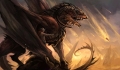
So ... here it is another month or two ... and I've just returned from PaizoCon 2012 last week, where I made an enormous amount of professional contacts. Various thrid party publishers like John Brazier Enterprises, Frog God Games, Open Design (Wolfgang Baur), Super Genius games, and even Reaper miniatures.
I also got to spend about an hour and a half with Wayne Reynolds essentially one-on-one, having a pint of beer, sitting outside on a veranda talking about art and the business of art. After some very poignant critique of my portfolio and sketchbook by Wayne, I've begun working on colour illustrations.
So, here are my most recent attempts at adding colour to an illustration from last year ... no, wait, two years ago. Many of you may've already seen it in its original sketch verion ... I posted it upthread when I originally did it. Obviously, I've not done work on the wings, and mostly concentrated on the coloration of the body. It was very different working on two different colour schemes, because the details were so much different to work on. The Tuscan Red details on the Crimson Red base was difficult to get the scales and whatnot to show. In the Olive version, the Dark Green picked out the scales with ease, but, the other values that I had to use (Grass Green, True Green, Lime Green, Light Umber, Ginger Root, and Jasmine) meant that I used up just as much pigment. I'd gone out and bought over 65 new coloured pencils (I use Prismacolor Premier, for those artists interested). My girlfriend suggested which piece to use, and when she saw the first (red) version she remarked that she liked it, but, she'd been expecting a different colour. Thus, came the second one.
At any rate, here they are. I'd love to hear what you guys think of them. For sake of reference, you can click on each each image to see the full-sized version of it in my Dropbox Gallery.
[Just remember that these are Intellectual Property, and they may be only downloaded for personal use, and are not to be reposted anywhere without consent.]
Interesting, I see exactly what you mean the red is sleek and the green displays scales much better. Perhaps a marriage of the two colors. Base red and highlight the areas where green seems to shine like the scales on the arms. I was also thinking to pull the colors together the inside of the wings probably a green to reddish black at its tips and red with green highlights on the scaled side of the wing. I would like to see how it turns out.
Hi there, all! Imagine my surprise when I was perusing Canonfire!, and stumbled across this thread! Imagine my surprise when I realized that I had forgotten all about it!
I took a break from my art a while back, and with University work when I started pursuing a Masters' of Illustration, I got so busy that I stopped posting here.
So, in the interest of keeping in touch, I thought I would post a little something.
This hippogriff was published by Legendary Games, in their "mythic" series in Mythic Monsters: Mounts, which is a collection of unusual creatures that can be used as mounts.
I often am told that it's a great piece, because one can see the pencil-work, which adds to the texture and feel of the illustration. ... the interesting thing is that it never existed physically, and is completely digital. The software I use (Corel Painter 12, at the time) is amazing at mimicking real-world media, and is geared specifically for doing that.
That is a great rendition of a hippogriff, Icarus! :smile
Thanks, man. I appreciate that.
It's difficult getting back into the field, ya' know? But, I'm attending three conventions in the next 90 days or so, and I've been asked to join the staff of Greyhawk Reborn (and I accepted) ... so, hopefully I'll start making industry contacts again, and hopefully start getting back into published art.
"Wait!! Did he say he's on the Greyhawk Reborn staff, now?"
Yes. Yes, I did.
They're really growing, and reaching out. I think not only will I love working with GH again, but, it'll get me to actively reaching out to the gaming community as a professional artist.
Awesome! I sure wish I had time to be involved in Greyhawk Reborn. Some day...
So, here's another something I'\m working on.
I like the Pathfinder goblins designed by Wayne Reynolds, for Paizo Publishing. But, I don't know why they went with green goblins - I'd always believed they were red/orange ... which goes with Hobgoblins being that same color.
Anyway ... so, this little fella is modeled somewhat on the feel of the Pathfinder goblins, but, I've changed him substantially. I think that when I get to has feet, I'm going to make them larger, with big nails, and sort of longer, like they are in older editions of D&D.
I also think that I may shorten him a little, making him a little less lanky, and make him a little more small and "crouch-y" at the same time. It's a work-in-progress, so, there's still plenty of room for change.
Corel Painter 2017, Wacom Cintiq
Note that you can click on the image to see a high-res version.
[Just remember that this is Intellectual Property, copyrighted, and is not to be used without consent.]
So, here it is, a couple of years later, and things have changed *so* much!
I'm the owner/admin of Greyhawkonline.com, and I've been doing a lot of things lately, including producing the Oerth Journal. Issue #28 just came out, and the website is getting over 1,200 users a month.
But, I realized today this thread was kind of older now, and it's links have been broken AGAIN. Damnable hosting services!
So, I went all the way through the links, again, and updated them all. again.
So, here, I'm gonna make some posts, including some newer stuff. ...
Here's a couple for a project that I unfortunately didn't get to finish - because I really loved these two pieces. They were for a Pathfinder 3rd Party Publisher, who was writing an adventure at the time.
Here's another one
This was for a private commission I got, randomly, from the 'net.
A fella had been Googling for images of a hippogriff and found mine (that's posted further upthread), and really liked the art.
So, he bounced link -to-link, and landed on my online gallery which -for obvious reason- has contact information. So, he commissioned this heraldry.
It's completely made-up, but, we were going for a certain kind of look
Anyway, here's one of the work-in-progress sketches for it. It has a phoenix, a falcon, and a hippogriff, along with several individual symbols he was interested in like a scale, book, cadency mark, and motto (which, I think, was "Greatness is Earned").
Corel Painter, Wacom Cintiq
[Just remember that this is Intellectual Property, copyrighted, and is not to be used without consent.]
Here's two more, which are both from the seminar we did called "Celebrating Greyhawk: A Fandom Rennaisance" at GaryCon XI. The seminar handout became the first-ever print edition of the Oerth Journal (#28).
The first piece, the gryphon rider, was from the cover and the banshee wailing underwater was interior artwork for an adventure in the same handout that went to attendees of the seminar we did the panel for.
The gryphon and rider were inspired by the cover of the City of Greyhawk Boxed set.
Also, that banshee is a killer!! Written by Carlos Lising, the catacomb tomb she's in was compromised and flooded which means the sound of her magical scream is transmitted through the water and affects a MUCH larger area than normal! Like, almost the whole level!!
I apologize, in advance, to all the players who die from it, for my part in making the horrific creature come to life.
You cannot post new topics in this forum You cannot reply to topics in this forum You cannot edit your posts in this forum You cannot delete your posts in this forum You cannot vote in polls in this forum
Canonfire! is a production of the Thursday Group in assocation with GREYtalk and Canonfire! Enterprises