| Author |
Message |
Journeyman Greytalker
Joined: Sep 14, 2009
Posts: 171
From: Laporte IN.
Send private message
|
Sat Mar 27, 2010 6:59 am
Erol Otus
|
 REPLY
QUOTE
TOP
REPLY
QUOTE
TOP
|
|
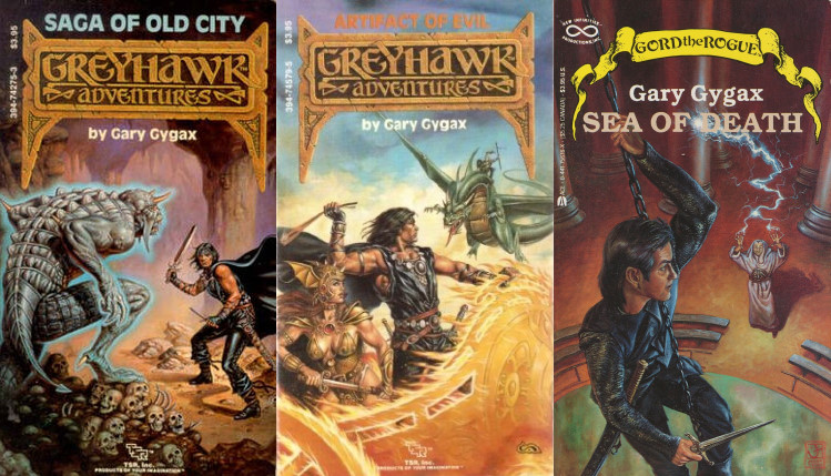
Just wanted to get every one's opinion on his artwork. I love his work. Takes me back when i was a kid looking at the cover of The lost caverns of tsojcanth ( had to look up the wording on that one  ) and castle amber and thinking WOW. ) and castle amber and thinking WOW.
|
|
|
Adept Greytalker
Joined: Feb 20, 2008
Posts: 594
Send private message
|
Sat Mar 27, 2010 8:07 am
|
REPLY
QUOTE
TOP
|
|
His artwork, to me, has more appeal as nostalgic than as good. I have always been a fan of more realistic artwork. I will never say he is bad...he just has his own style.
DnD, I think, benefited from his surreal work.
|
|
|
GreySage
Joined: Oct 06, 2008
Posts: 2788
From: South-Central Pennsylvania
Send private message
|
Sat Mar 27, 2010 9:00 am
|
REPLY
QUOTE
TOP
|
|
Chaotic pretty much said it for me. 
_________________
Mystic's web page: http://melkot.com/mysticscholar/index.html
Mystic's blog page: http://mysticscholar.blogspot.com/
|
|
|
Forum Moderator
Joined: Feb 26, 2004
Posts: 2592
From: Ullinois
Send private message
|
Sat Mar 27, 2010 2:01 pm
|
REPLY
QUOTE
TOP
|
|
|
chaotic: I know what you mean about Erol Otus being nostalgic rather than good. I've tried to parody his art before and it isn't easy. His color palette is something earthy-pastel that defies me. If I could sit in while one D&D artist worked, it would be him.
|
|
|
Grandmaster Greytalker
Joined: Nov 07, 2004
Posts: 1846
From: Mt. Smolderac
Send private message
|
Sun Mar 28, 2010 7:42 am
|
REPLY
QUOTE
TOP
|
|
|
I think it was pretty daring in the gaming industry to take on an artist with his style. I'm not crazy about most of his b&w work, but his color work is just incredible, especially the stuff he's been putting out over the last few years for companies like Goodman.
|
|
|
Apprentice Greytalker
Joined: Feb 01, 2008
Posts: 15
Send private message
|
Sun Mar 28, 2010 1:19 pm
|
REPLY
QUOTE
TOP
|
|
I know this is an older post, but couldn't resist responding. Loved his work when I was twelve and still love it(37).
Elf KIng B&W ink: If you look at the hilt of the sword You will notice DK. It looks alot like the Dead Kennedies (punk band) logo. Does anybody know of any other possible band references or Names of people in his art work. There is also a fighter with bracers stamped with HCO(acid?). I'm not a chemist.
|
|
|
Apprentice Greytalker
Joined: Nov 17, 2004
Posts: 52
From: Wales
Send private message
|
Tue Mar 30, 2010 11:01 am
|
REPLY
QUOTE
TOP
|
|
I remember the works well from when I first started playing in the early 1980s (1981+). It always brings back the nostalgia of those early games, and for that reason I am very fond of them. However, as many have also said, I can't say that they fire my imagination much now, as the style lacks the 'realistic' element which I like in my gaming nowadays.
Still a class act of its time though!
|
|
|
Black Hand of Oblivion
Joined: Feb 16, 2003
Posts: 3835
From: So. Cal
Send private message
|
Thu Apr 01, 2010 11:21 pm
|
REPLY
QUOTE
TOP
|
|
Otis is very nostalgic for me, mainly due to him having done the covers of the Basic and Expert Sets which were the first D&D products I ever owned. I really like his ultra clean and unique style too though.
I will forever view him as the "Father of Snail Mail"(mail represented as curly-ques in his art), and the "Father of Sand Mail"(mail represented using pointillism). 
_________________
- Moderator/Admin (in some areas)/Member -
|
|
|
Master Greytalker
Joined: Nov 01, 2007
Posts: 699
From: On a Cape on the East Coast
Send private message
|
Sun Apr 04, 2010 9:54 pm
Erol Otus nostalgia
|
REPLY
QUOTE
TOP
|
|
| smillan_31 wrote: |
| I'm not crazy about most of his b&w work, but his color work is just incredible, especially the stuff he's been putting out over the last few years for companies like Goodman. |
Absolutely ... I think that the stuff from Goodman is really neat, and it's cool that the Dungeon Crawl Classics line has his artwork on it. The first time I saw it, I could see some slight differences that have made it into his style over the years, but the moment I saw it, I looked at my roommate and said, "Good Lord, but this looks nearly like Erol Otus ... someone has done a near perfect job of copying his style." ... and then I looked at the credits and was amazed to find it was him!
As has been repeatedly said, I think that it's more a fact of nostalgia than anything. But, it's like the fact that I want to own a 1963 Austin Healy Bug-eyed Sprite. It's not that it's really fast, or suped up ... it's just cool because of the way it looks. Nostalgia is a wonderful thing.
_________________
Owner and Lead Admin: https://greyhawkonline.com<div>Editor-in-Chief of the Oerth Journal: https://greyhawkonline.com/oerthjournal</div><div>Visit my professional art gallery: https://wkristophnolen.daportfolio.com</div>
|
|
|
|